To date, we have been known as the go-to agency for all creative design and marketing with a sports and fitness focus.
That’s a pretty awesome place to be of course, but then we thought long and hard about our offering and if that really represents where it is we are now and where we want to be tomorrow. Today’s health and wellness landscape is so much more than just the physical action of sports and fitness where you’d expect engaging in sports and fitness to make you feel good. As usual for Zephyr, we wanted to do more so inspired by this drive to re-focus and ultimately reposition our business, we have a good long hard look at what it is we really want to achieve. We want to make people feel GREAT!
We don’t expect to change the world (straight away), and this may seem like a subtle shift, but we do feel we can play a part in the bigger picture so we have overhauled our core mission to better reflect what it is we see our role as:
Using creativity, active health and wellness to inspire social change.
As we said, we don’t expect to change the world, not on our own anyway, however, if we can inspire our new and current clients to join us on this journey by looking at their current objectives with a more holistic approach, we think we’ll be a good way there.
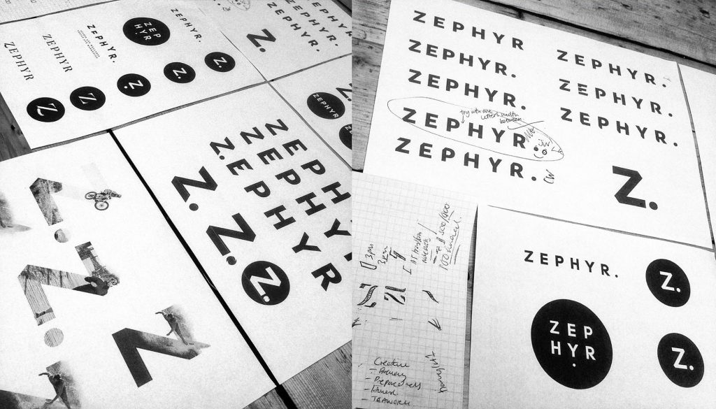
As normally happens with a re-think about a brand, we had to turn our creative thinking inwards and give our brand a bit of a refresh which, as you can see, has resulted in some subtle changes to our brand on a visual level, but also being clearer about our passion and drive to push the health and wellness agenda forward for us all.
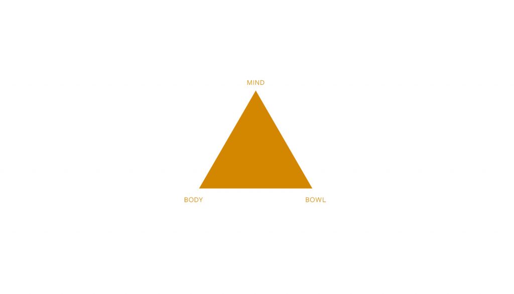
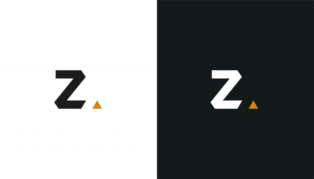
You might have missed this but the dot after our Z. is no longer… it’s now an equilateral triangle instead of a dot! The same simple stand-alone word followed by the equilateral triangle symbolises the three pinnacles of our mission with equal importance; mind body and bowl.
Our new and striking colour palette utilising three simple colours, black, white and gold. Black and white relate to the seriousness of the impact physical inactivity is having on our society i.e. there is no grey area; but it also has the most contrast and therefore the most visual impact. Gold has been chosen to reflect the fact that physical activity is the golden thread to social change. Finally, the combination of these three colours creates a sense of professionalism, quality and demands to be noticed. A winning combination all round.
Who are we?!
On a deeper level, the whole team sat down and discussed our values and who we felt we really were and ultimately how this impacted and added value to our clients.
We are brave…
When working with us you need to be prepared to be made to feel uncomfortable! We’ll push you to think differently – to be more ambitious.
We are empathetic…
Understanding you and your business on a deeper level, so we can serve you better. We like to talk, but more importantly – we listen.
We are creative…
We don’t conform to the norm, we are divergent thinkers. We connect the dots where others haven’t. Design gets you noticed, creativity makes you memorable.
We are knowledgeable…
We’re experts in our industry and we join the party – ready to go.
We don’t just love it, we live it.
Our underlying values have always been the same, it’s just good to say it out loud and to make sure the whole team is fully on board with who we are as a brand. At every touch point – when we pick up the phone, start a new project, complete on a project these brand values should always be in the forefront of our minds – ensuring that all customers get the ultimate Zephyr experience and see the true value of working with us.
So be prepared – it may be an uncomfortable ride at times but pushing boundaries will achieve real results.


Leave a Reply