Brief
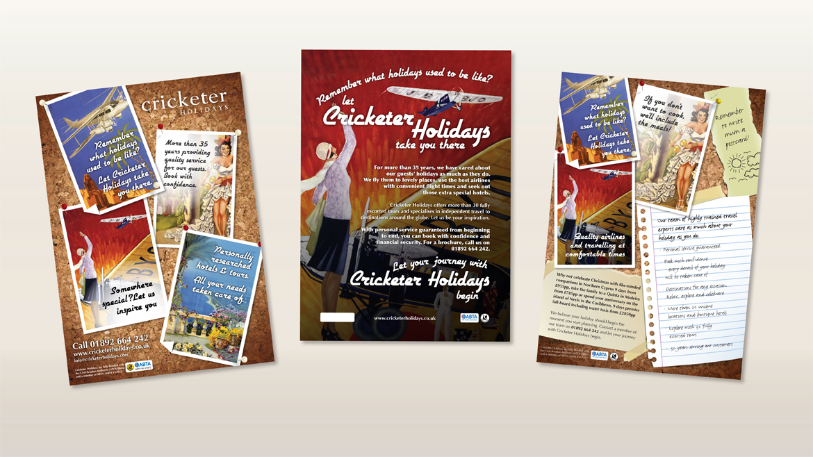
Zephyr was asked to bring character to an advertising campaign by updating design, there copy and imagery.
Solution
We wanted to ensure the adverts would appeal to Cricketer’s target market – high end travellers, generic looking for a well organised, case no expenses spared holiday. (Oh, what we’d do for one of those!)
We chose distinguished, old school characters, 1920s style, for the adverts. We like to think this added a touch of class, and was complemented by rich colours, quirky language and ‘to the point’ messaging.


Leave a Reply