As the year end is drawing closer our designers, Lou, Andy and Matt look back at what they have learnt and look forward to what exciting trends and innovations they expect to see in 2017.
Trend from 2016
This year has certainly been a busy one at Zephyr HQ! With new clients, moving to a new studio, big boss Jody getting married and then having her little bundle of joy Jago, which meant that we had the opportunity of taking on TheKiteMag… With a whopping 40.5k followers on Instagram and 19,229 likes on Facebook we’re not going to lie, it has been a bit hectic at times but honestly we enjoyed every minute of it!!
Working on this project we’ve noticed the trend of using simple layouts and unique (hipster) typography has been a big thing in design lately. Don’t get us wrong it’s not a bad thing at all, in fact less is quite often means so much more…
The latest issue of the magazine is now on sale, complete with a snazzy block foil logo and the 2017 brand guide, to give you the lowdown on all the latest kit available.
Visit www.thekitemag.com
Looking to 2017 –
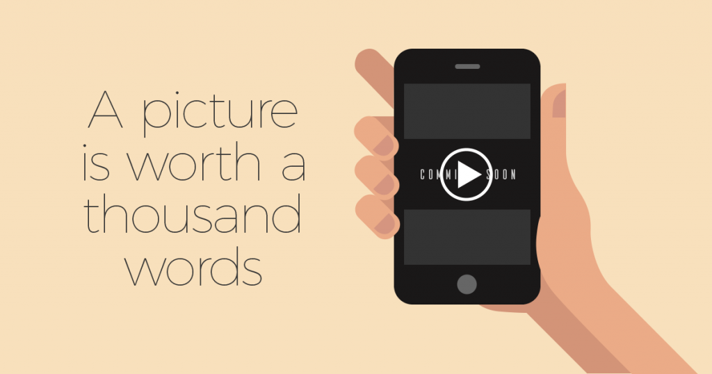
Video has been around a long time but it became a big deal in 2016 with the rise of faster internet connections. Branching out to live streaming on social media and being able to have high quality video on websites, it is going to continue to grow in 2017, there is no point ignoring it. The saying goes a picture is worth a thousand words, well imagine how many words a moving picture is worth…
Showing off your product or service through the format of video is effective, because people like watching videos… In fact people can process visual elements 60 thousand times faster than reading. Statistics suggest that 80% of viewers remember a commercial for 30 days after seeing it, and that 64% are more likely to make a purchase after seeing the video.
Source: designcontest.com
Flat design… Trend or Triumph?
You could argue that ‘flat design’ started in the 40’s and 50’s when Swiss style was the bee’s knees. You could say that the Swiss style is just an ancestor to flat design and that flat design is the Swiss styles’ trendier replacement for the modern world.
One of the things we picked up on from 2016 was this: flat design is here to stay. We thought it would just be another trend that would pass the design world by in a few years, but it seems with our advances in technology, flat design has found a home and it’s in no rush to pack up it’s things and leave.
Kudos.
Is there a place for nice graphic design in VR?
VR (or virtual reality) is attempting to take over the world. VR has its roots firmly planted in gaming but recently it’s been bleeding into other categories such as news and education.
With the potential to produce beautiful and functional screen graphics, graphic designers should be looking to exploit the VR market while it’s here.
Imagine a world where info-graphics weren’t static or where guided tours revealed animated information about a person, place or thing integral to the tour. Think of all of the things that graphic design could give to the VR world. It’s at least plausible, right?
VR marketing may be a tad on the expensive side at the moment but it’s worth considering, especially in a world where we’re constantly glued to our mobile devices…
The design experience.
Over this year we have really tried to focus on client experience and how we can be a better designer for our clients. Every client is different so therefore it’s up to us to adapt to what the clients needs and most importantly listen to their expectations. With a number of branding projects we have worked on, the design process remains the same but, obviously timescales differ and it’s up to us to be flexible and manage client expectations. We keep the client involved every step of the way, this provides them the knowledge of how the design process works, as well as allowing them constant input into their project. From our point of view it’s always about making sure the client is getting value for money as well as a high quality design solution.
Prioritising Mobile Design
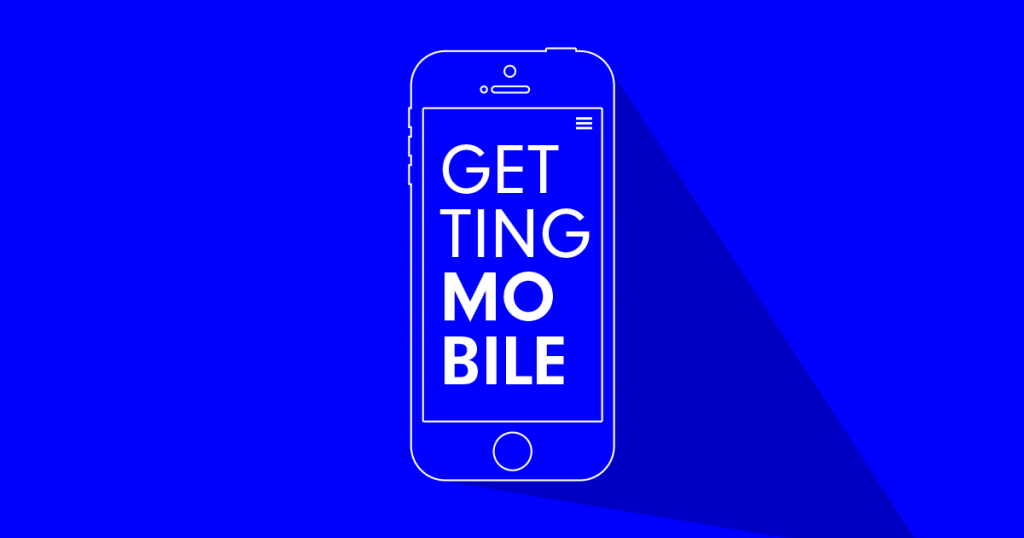
How is your online mobile strategy coming along? If you haven’t thought about it you probably should. Ofcom reports that 33% of internet users see their smartphone as the most important device for going online, compared to 30% who are still sticking with their laptop.
Therefore there is now more focus than ever on mobile first design, when it comes to your website. There has always been a focus on mobile first from a development aspect, but there has been debates over whether design needs that approach. The most important reason for focusing on mobile first is from a user viewpoint, ensuring they can get the desired information, because at the end of the day the website isn’t being designed for the client or the designer. There is still a necessity to design for a desktop / laptop device, but usage of these have declined since 2014.


Leave a Reply